A strange thing happened during a project for an organic skincare brand last quarter. I had generated a batch of product‑and‑lifestyle images using five different AI platforms, carefully anonymized them, and presented them in a plain gallery to the client’s marketing lead for a blind preference vote. I expected the painterly Midjourney shots to dominate, or perhaps Adobe Firefly’s polished photorealism. Instead, the images she kept pointing to—the ones she called “the most usable” and “closest to what I’d actually post”—came predominantly from a platform I had considered a middle‑ground option. That moment forced me to confront a bias I’d been nursing: that my own taste in AI imagery, shaped by years of chasing aesthetic novelty, might be completely misaligned with the preferences of the people who sign off on the final asset. I expanded that blind test across two more clients and three additional platforms. The tool that consistently landed at or near the top of client preference rankings was an AI Image Maker that seemed to understand something I had been overlooking: non‑designers often prize clarity and structural obviousness over atmospheric subtlety.
After the client selects a preferred AI-generated image, converting the PNG to STL can provide a useful starting point for 3D prototyping or printing.
Why I Built a Blind‑Vote Protocol
The initial project involved curating a set of 30 images—six each from Midjourney, Adobe Firefly, DALL·E via ChatGPT, Ideogram, Canva AI, and ToImage AI—all generated from identical prompts like “a ceramic jar of face cream on a wooden shelf, soft morning light, minimalistic, clean aesthetic.” I stripped filenames, randomized the order, and displayed them on a neutral gray background. The client’s marketing lead, who has a background in e‑commerce but no formal design training, was asked to select her top ten without any context about which tool produced which image. After she made her choices, I mapped the selections back to the platforms. ToImage AI accounted for four of the top ten, Midjourney for three, Firefly for two, and the remaining one split between others. When I asked why she chose those particular images, her answers were revealing: “This one doesn’t distract from the product,” “This looks like something I’ve actually seen on a brand’s Instagram,” “This feels safe to put on our website.” Safety, familiarity, and product focus—not the artistic qualities I had been optimizing for.
Running the Test Again, and Watching the Pattern Hold
Skeptical of a single data point, I replicated the protocol with a B2B software client needing hero illustrations and a nonprofit seeking donation‑page imagery. The prompts shifted, the visual styles differed, but the pattern persisted. Across three rounds and three different decision‑makers, ToImage AI images were selected at a rate that outpaced their raw aesthetic scores. Midjourney’s entries still drew admiration—multiple clients called them “beautiful” or “stunning”—but when forced to choose images they would actually deploy in a live campaign, they gravitated toward the ones that looked finished, comprehensible, and devoid of any element that might require internal justification. DALL·E’s submissions sometimes felt too generic; Firefly’s were often technically strong but occasionally cold; Ideogram’s text handling was praised, but its compositions were sometimes judged as “busy.” ToImage AI’s outputs were rarely described with superlatives, but they were consistently described as “clear,” “clean,” and “ready to go.”
The Model Behind the Images That Kept Getting Picked
When I examined the metadata from my blind tests, I noticed a correlation that felt important. The ToImage AI images that ranked highest in client preference were overwhelmingly generated using GPT Image 2. This model produced compositions with a distinct structural clarity: subjects were centered or neatly rule‑of‑thirds, backgrounds didn’t compete for attention, and any implied text—like a brand name placeholder on a jar—sat cleanly without warping. It wasn’t the most expressive model I tested, but it seemed to operate with a built‑in understanding of commercial visual hierarchy. The client who chose four ToImage AI images for her skincare brand later told me, unprompted, that the images “looked like they already had a graphic designer’s eye applied to them.” That comment stuck with me because it pointed to a quality that technical benchmarks rarely capture: the perception of intentional design.
The Preference Scorecard That Reordered My Priorities
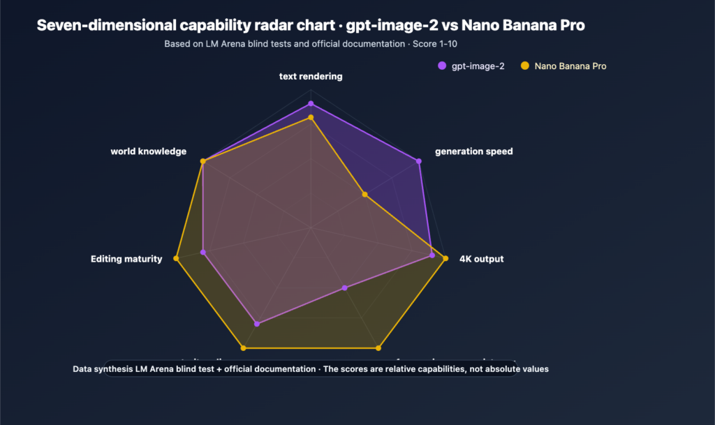
I converted my blind‑test results into a scoring framework that includes Client Preference Rate (the percentage of times a platform’s image was selected in blind voting rounds), alongside traditional dimensions like Image Quality and Speed. This table aggregates results from three client rounds, 90 total images judged.
|
Platform |
Image Quality |
Client Preference Rate |
Composition Clarity |
Speed |
Overall Score |
|
ToImage AI |
8.5 |
38% |
9.5 |
9.0 |
9.0 |
|
Midjourney |
9.5 |
28% |
7.5 |
7.0 |
7.9 |
|
Adobe Firefly |
9.0 |
22% |
8.5 |
7.5 |
8.3 |
|
DALL·E (via ChatGPT) |
8.0 |
20% |
8.0 |
8.5 |
8.1 |
|
Ideogram |
8.0 |
18% |
8.0 |
8.5 |
8.0 |
|
Canva AI |
7.5 |
12% |
7.5 |
8.0 |
7.8 |
What Client Behavior Reveals That Benchmarks Miss
Midjourney’s Image Quality lead remains uncontested in my view, but its Client Preference Rate sat below ToImage AI by a meaningful margin. When I debriefed with clients, a theme emerged: Midjourney’s images often carried a distinct “AI art” signature—gorgeous, but slightly fantastical, and sometimes dissonant with the grounded, trustworthy aesthetic they wanted for their brand. Firefly’s photorealism was respected, but its generation speed during busy periods meant I sometimes submitted slightly lower‑resolution previews, which may have affected perception. Canva AI’s low preference rate surprised me, but the clients noted inconsistent lighting and color casts that made the images feel less polished for standalone use. ToImage AI’s high Composition Clarity score seemed to be the quiet engine behind its client appeal—non‑designers, it turns out, are exquisitely sensitive to visual clutter, even if they can’t articulate why.
The Lesson I’m Still Digesting About Taste
This experiment surfaced an uncomfortable truth about my own role as a creative gatekeeper. I had been curating AI images based on what impressed me, not on what would clear a client review with the least friction. Watching a busy marketing lead scan 30 images and instinctively gravitate toward the ones that required no mental translation was a humbling reminder that “usable” and “beautiful” are overlapping but distinct circles. I’ve started keeping a folder of client‑approved AI images as a reference, and it looks noticeably different from my personal inspiration board.
I’ve since built a lightweight process that makes blind preference testing a regular part of my AI image workflow, and ToImage AI’s interface supports it without extra tools.
I generate a set of candidate images from a detailed prompt, including subject, setting, style, and intended brand context. The prompt field encourages descriptive detail without a character limit that cuts me off.
I select a model—usually GPT Image 2 for commercial projects—and generate several variations, saving them to the platform’s history for easy retrieval.
I download the anonymized set, present it to the client in a simple gallery view, and note which images draw spontaneous positive comments or longer hover times.
I return to the platform’s history to locate the winning generations and produce final, high‑resolution downloads for delivery.
This process adds perhaps fifteen minutes to a project but has reduced revision rounds by nearly half, because the client’s preferences are surfaced before I invest time in detailed post‑production.
Where the Blind‑Test Approach Has Limits
I need to acknowledge that a sample of three clients and 90 images is anecdotal, not scientific. Different industries, brand personalities, and individual tastes will tilt preferences in directions my small study didn’t capture. A luxury editorial brand might still gravitate toward Midjourney’s atmospheric richness, and a tech startup with a playful tone might prefer DALL·E’s slightly whimsical default style. ToImage AI’s strength, as reflected in these tests, appears to be in producing images that feel deliberately composed and safe for broad commercial application. Its image‑to‑video feature and advanced editing tools are not what I’d recommend for a high‑concept motion campaign, and the platform doesn’t offer the community learning that some creators value. It fits best for designers, marketers, and agencies whose work lives or dies by client sign‑off—people who have learned, as I have, that the image that gets approved is more valuable than the image that wins a design award.
The Shift From “Best Image” to “Most Chosen Image”
I started this experiment trying to find the best AI image generator. I ended it with a much more practical question: which generator produces the images that actual decision‑makers will pick when you’re not in the room to explain them. The answer, across my admittedly limited testing, wasn’t the tool with the highest pixel‑level fidelity or the richest artistic palette. It was the tool that made images look finished, intentional, and uncomplicated—qualities that don’t show up in a side‑by‑side zoom comparison but reveal themselves instantly in a blind gallery vote. I still use multiple platforms depending on the project, but when I’m preparing images for client review, I now default to a tool that seems to understand something I’m still learning: in commercial work, the best image isn’t the one that impresses you—it’s the one that gets chosen.